Do you know how to align form labels?
Loading last updated info...
There are different ways to align your form labels and each has its own pros and cons.
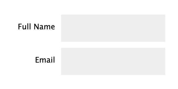
1. Left-aligned
When labels are left-aligned, the spacing between labels and input fields becomes inconsistent. The excessive visual distance between the labels and their corresponding input fields is a problem.
✅ Pros
- Easy to scan labels, especially if you have a lot of optional labels
- Takes a little more attention to fill in, so useful for complicated forms that require accuracy
❌ Cons
- Horizontal space, unlike vertical space, is not limitless, and an unintended horizontal scrollbar is the first sin of web development
- Slowest completion times
- Poor multilanguage support
- Not even very good responsive support
❌ Figure: Bad example - Inconsistent spacing between labels and input fields
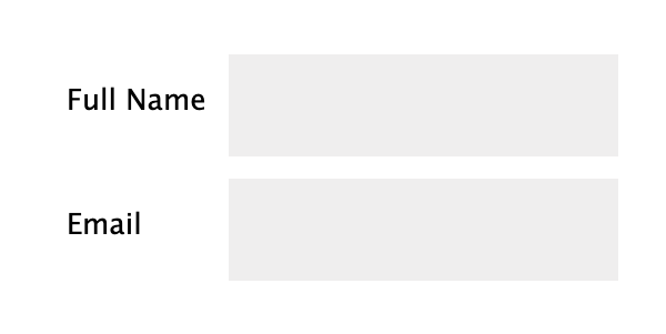
2. Right-aligned
Right-aligning labels ensures a consistent visual distance between the labels and their corresponding fields across the form. This strengthens the association between them, as objects placed closer together are perceived as related.
However, the inconsistent spacing on the left side of the forms makes it harder to scan the fields, leading to user discomfort and slower completion of lengthy forms.
✅ Pros
- Best at linking label and form
- Good completion rates on small, common forms (i.e. Login, Sign up)
❌ Cons
- Hardest to read and scan
- Poor multilanguage support
- Poor responsive support
🙂 Figure: OK example - If aligning labels inline is necessary, opt for right-aligned labels
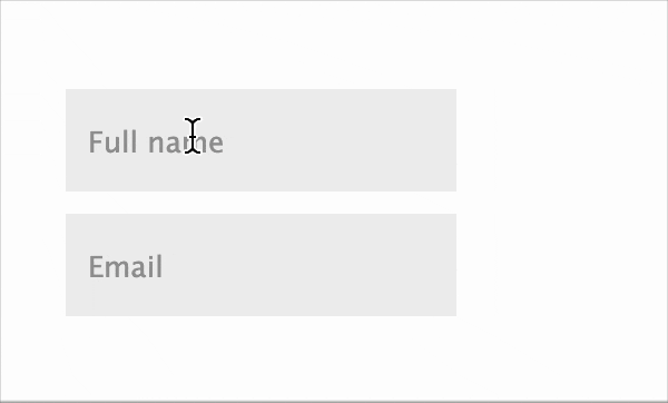
3. Top-aligned
In addition to being more visually appealing, placing labels above the input fields minimizes the visual distance between the label and the input field, creating a stronger cognitive association and enabling faster user response.
The downside of this alignment is that it increases the overall height of the form.
✅ Pros
- Easiest to process
- Fastest completion times
- Good for multiple languages
❌ Cons
- Takes up a lot of vertical space
- Makes a long-form look even longer

🙂 Figure: OK example - Top-aligned labels are space-efficient, making it adaptable to all resolutions
4. Adaptive placeholders
Adaptive placeholders are form labels that become into placeholders and vice-versa, depending on which fields have been filled or not. The placeholder is placed inside the form and slides up on focus and after field is filled. It gives the form a great UX.
✅ Pros
- Best for readability
- Best for visual connectivity
- Best for completion rates
- Decent multilanguage support
- Decent responsive support
❌ Cons
- Time-consuming to implement. Need to consider the cost/benefit
- Not always available on 3rd party platforms, like Wufoo or Microsoft Forms
✅ Figure: Good example - Using adaptive placeholders
You can find more useful information and examples in this nice article: Form design best practices.