Data Layout - Do you use expressions to show the correct scale on charts?
Loading last updated info...
In Reporting Services 2005 you can use an expression to specify the scale of your charts. If you do not specify a maximum value for your y axis, the bar charts become inaccurate, as you can see in this figure.
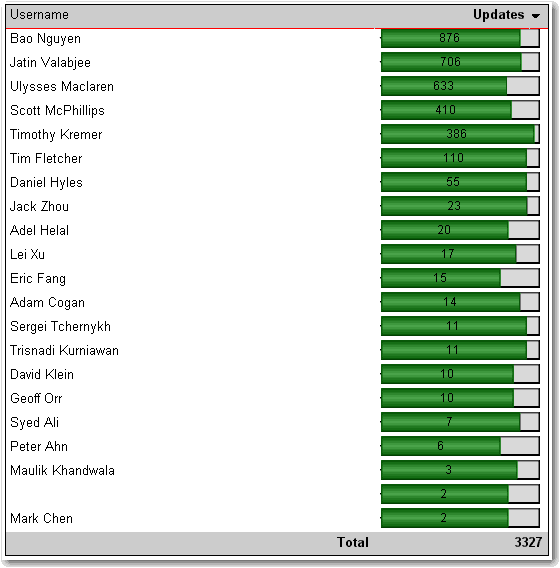
❌ Figure: Bad example - With no scale value set, the charts do not display based on the correct scale
Here's how to set the scale.
- In Layout view, add a new row to the bottom of the table
- At the bottom of the column with the chart, set the textbox value to =Max(Fields!MyTotal.Value), where "MyTotal" is the Data field you're using in the chart.
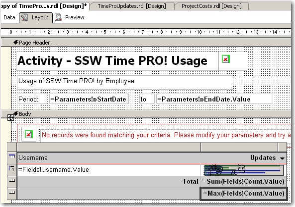
Figure: Add a new row to your table and set the max value
- Set the textbox's Name property to MaxMyTotal (e.g. MaxCount)
- Set the new row's Visibility/Hidden property to true - you don't want to show it in the report
- Open the Chart properties and select the "Y Axis" tab
- Set the Maximum value to the value of the textbox, i.e. "=ReportItems!MaxMyTotal.Value"
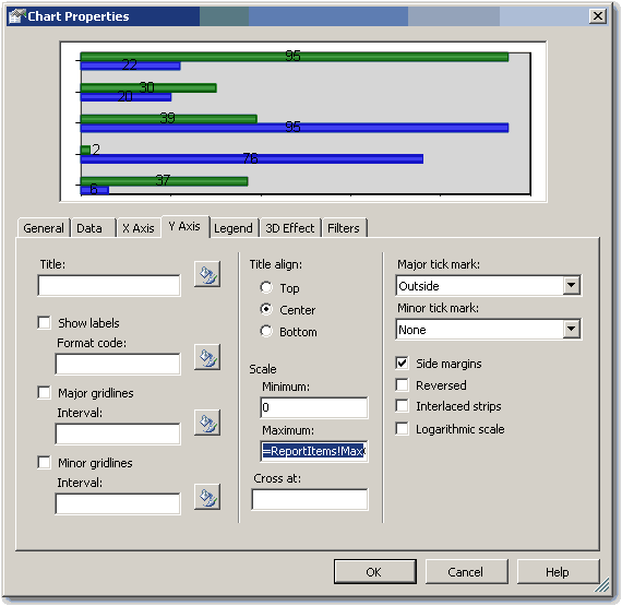
Figure: Set the maximum value to the value of the textbox
- If you expect to have negative values in the chart (e.g. when comparing 2 values), set the Minimum to -1 multiplied by the max value, i.e. "=-1 * ReportItems!MaxMyTotal.Value". Otherwise set it to 0 (zero).
- If you expect to have negative values in the chart, select the chart value in the Data tab and click "Edit..." . Go to Appearance->Series Style->Fill and enter the following expression:
=iif(Fields!Change.Value > 0, "Green", "Red")
Where "Change" is the name of your data field. This sets the color of the bar to green if it is positive, and red if it is negative
- Click OK and preview the report. The chart will now be using the maximum value across all the charts.
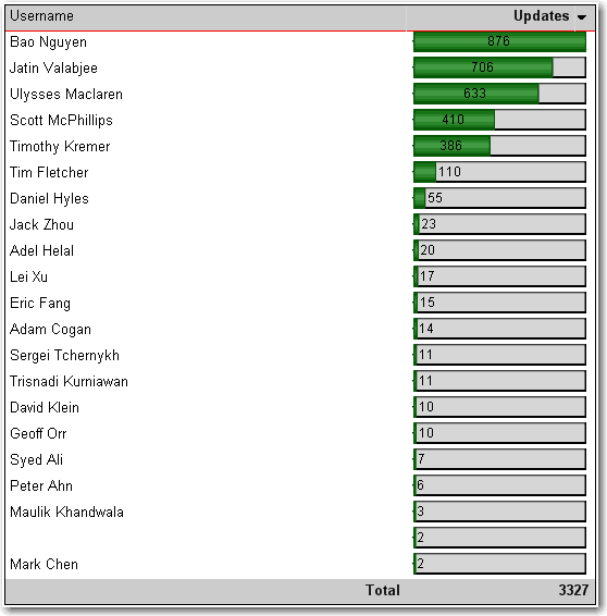
✅ Figure: Good example - The scale is now correct
This way is tedious and a "hack". We think that the scale should be automatically set with an option to customize it via an expression. See our suggestion about this on Microsoft SQL Reporting Services Suggestions.
Updated - fixed by Microsoft, see https://learn.microsoft.com/en-us/sql/reporting-services/report-design/set-a-minimum-or-maximum-on-a-gauge-report-builder-and-ssrs?view=sql-server-ver16&WT.mc_id=DP-MVP-33518