Messages - Do you clearly show a pass, fail or warning?
Loading last updated info...
When a user looks at a test result, they want to be quickly informed. Therefore, you must make it clear weather the test has passed or failed, or is there any warning.
- For a pass, the message should be green in color, and a tick next to the message.

- For a fail, the message should be red in color, and a cross next to the message.

- For a warning, the message should be yellow/orange in color, and an exclamation mark next to the message.

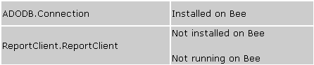
❌ Figure: Bad Example - Pass and fail are not clear
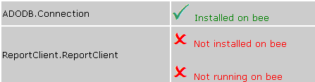
Figure: Green text and tick for pass, red text and cross for fail (Better)

✅ Figure: Good Example - Status on windows forms
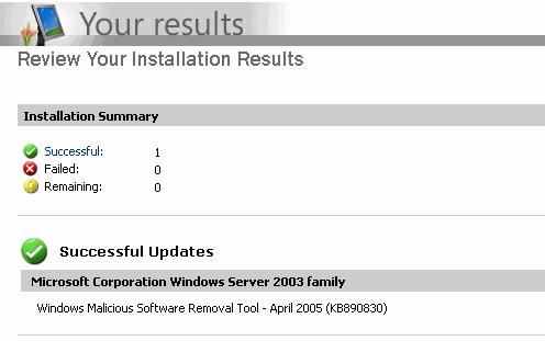
✅ Figure: Good Example - Microsoft Update uses 3 icons to indicate different status, and good quality of Images too