If you still need help, visit Website Design and User Experience and book in a consultant.
Popups are intrusive and ugly.
JavaScript alerts are evil. Not only are they ugly, they look unprofessional...
Some people like popup forms. Some do not.
Popup modal forms are no good:
- as you can't read or edit something else in a window behind
- as they take a lot of time to load in a browser (ask any CRM 4 user)
Question: What is wrong with this Picture?

Figure: Can you tell what is wrong with this Picture?
Now, if you can't get rid of message boxes; try again.
There is nothing quite as annoying as persistent pop up message boxes, demanding your attention. Imagine you are working on a train, you are in between two fat people and your elbows are tucked in. Not only that the trackpad barely works and the user does not know that [spacebar] works on a message box.
Now think of that scenario every time you give a user a message box.
If you do a search and no matches are found, display a message indicating zero results were returned rather than an error message.
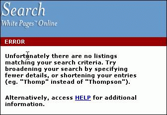
❌ Figure: Bad Example - No matches found on searching is not an "Error"
Message boxes should have consistent and informative titles and descriptions, and icons should be used appropriately.
Description
The description should explain what the error was, followed by the why it occurred. Information that is useful for debugging should be included with errors where possible in a "Details" section. You should also avoid making the text unnecessarily wide. e.g.
Icon
Including an icon is important because not only does it give the user a visual indication of the type of message, but without it only the Default beep sound is used. The icon should reflect the type of information being presented:
When a user looks at a test result, they want to be quickly informed. Therefore, you must make it clear weather the test has passed or failed, or is there any warning.
per page
1 - 10 of 14 itemsper page
1 - 10 of 14 items